How to Create Interactive Dashboards That Truly Engage and Inform
In today’s fast-paced, data-driven world, dashboards have become essential tools for turning raw data into meaningful insights. But not all dashboards are created equal. A well-designed, interactive dashboard can go beyond displaying numbers—it can tell a compelling story, capture attention and empower decision-makers. Let’s dive into how to create dashboards that not only present information but also engage users and drive impactful actions.

1. Start with the End in Mind: Defining Your Dashboard’s Purpose
The foundation of any successful dashboard lies in its purpose. Before jumping into design or data visualization, you must first have a clear understanding of why you’re creating the dashboard and who will be using it. Begin by identifying the key stakeholders or end-users. Are they executives looking for high-level insights, team leaders tracking performance, or analysts needing granular data? Understanding the audience will influence everything from the layout to the type of data you include.
Next, focus on the decisions this dashboard is meant to support. Is it helping to optimize sales strategies, monitor marketing campaign success, or track daily operational efficiency? By knowing what decisions your users need to make, you can prioritize the most relevant KPIs (Key Performance Indicators) and data points. Avoid the trap of trying to include everything—stick to the information that drives meaningful action.
Once you know the audience and decision points, think about how the data should be presented to make it actionable. Will a high-level overview be sufficient, or should users be able to drill down into detailed metrics? If the dashboard is for executives, simplicity and clarity will be key, with emphasis on trends and high-level metrics. For operational staff, providing the ability to dive into specifics might be more useful, so incorporating filters and slicers will allow them to explore deeper insights.
Additionally, consider the frequency of the data updates. If your dashboard is meant to inform daily decisions, it may need real-time data integration. Conversely, for long-term strategy planning, historical data trends might take precedence over live updates.
By defining the purpose early, you not only streamline the design process but also ensure the dashboard remains focused, avoiding information overload and ensuring that users can quickly find the insights they need to drive actions.
2. Make It Visually Appealing, Yet Simple
Design is the secret weapon of any great dashboard. Keep the design clean and avoid cluttering the screen with too many visuals. The goal is to make the data shine, not to overwhelm users. Stick to a few key visual elements like charts, graphs and KPIs that tell a clear story. Remember, simplicity is the key to clarity.
But simple doesn’t mean boring! Use color strategically to draw attention to important data points or trends. Leverage white space to create a balanced and easy-to-read layout. And most importantly, make sure the design aligns with your brand for a polished, professional look.
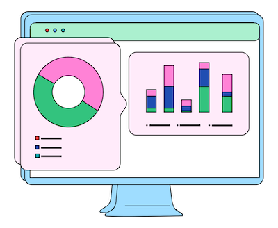
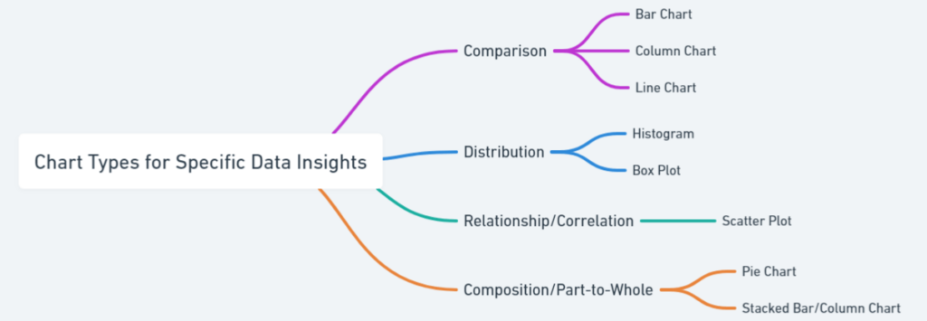
3. Use the Right Visuals for the Right Insights
Choosing the right type of visualization is critical. The wrong visual can obscure meaning, while the right one brings clarity:
- Bar charts are excellent for comparisons.
- Line charts showcase trends over time.
- Pie charts offer insights into proportions (but use sparingly).
- Heatmaps reveal patterns and density across datasets.
Interactive elements like hover-over tooltips, clickable data points and real-time filters can bring the dashboard to life, making it feel more like an exploration rather than just a static report.
4. Interactive Filters: Let Users Control the Story
Interactivity is what sets great dashboards apart from static reports. Filters and slicers let users drill down into the data that matters most to them. Give users the ability to filter by time period, region, or other key dimensions, so they can customize their view of the data without losing the bigger picture.
In tools like Power BI or Tableau, adding interactive slicers transforms a dashboard into a dynamic tool, allowing users to dive deep into specific segments or zoom out for a macro view.
5. Design for All Screens: Go Beyond Desktop
We live in a mobile world and so should your dashboard. Whether your audience is at their desk or on the go, your dashboard needs to be responsive and adaptable across devices. Ensure your design adjusts seamlessly from desktops to tablets and smartphones. Tools like Power BI offer mobile-optimized layouts that maintain usability without sacrificing visual appeal.
6. Real-Time Data: Keep It Fresh
In a world where decisions can change on a dime, outdated data is irrelevant data. Real-time dashboards that update automatically from live data sources keep your audience informed with the latest insights. Whether tracking sales targets, marketing campaign performance, or supply chain metrics, real-time data ensures decisions are always based on the freshest information.
7. Tell a Story with Data
A dashboard is more than just a collection of charts—it’s a narrative. Use your dashboard to guide users through the data, helping them discover insights along the way. Highlight trends, call out anomalies and use annotations to explain key points.
For example, a line chart showing sales growth over time can be enriched with context: Why did sales spike in Q2? What external factors contributed to the decline in Q4? Guiding users through the data, much like a storyteller, makes the dashboard more engaging and insightful.
8. Test, Learn and Improve
Even the most beautiful dashboard needs user feedback. Before launching to your full audience, conduct user testing with a small group. Watch how they interact with the dashboard—are they able to navigate it easily? Do they understand the data? Are they getting the insights they need?
Feedback is gold. Use it to tweak, simplify, or enhance the experience. A well-tested dashboard is more likely to hit the mark and become an indispensable tool for its users.
9. Measure Engagement and Refine Over Time
Once your dashboard is live, don’t just leave it be—track how it’s being used. Which parts of the dashboard get the most attention? Which filters or data points are ignored? Tools like Power BI offer built-in analytics to measure dashboard engagement, giving you insights into how users are interacting with your creation.
Based on this feedback, continue refining and updating the dashboard to ensure it stays relevant and useful. A dashboard should evolve as the business and user needs change.
Conclusion: Engage, Inform and Inspire
A powerful, interactive dashboard does more than just present data—it creates an experience. By focusing on user experience, clear visual storytelling and interactivity, you can transform your dashboard into a tool that not only informs but also inspires action. Whether you’re building for executives, analysts, or front-line workers, the goal remains the same: engage your users and empower them to make smarter decisions, faster.
With these strategies in hand, your dashboards can become the backbone of insightful, data-driven decision-making within your organization.